Adam's Notes

Share this post

Texture in illustration

adamming.substack.com

Texture in illustration

Series: Some notes on style by Adam Ming

Adam Ming
Sep 8, 2021
1
Share this post

Texture in illustration

adamming.substack.com

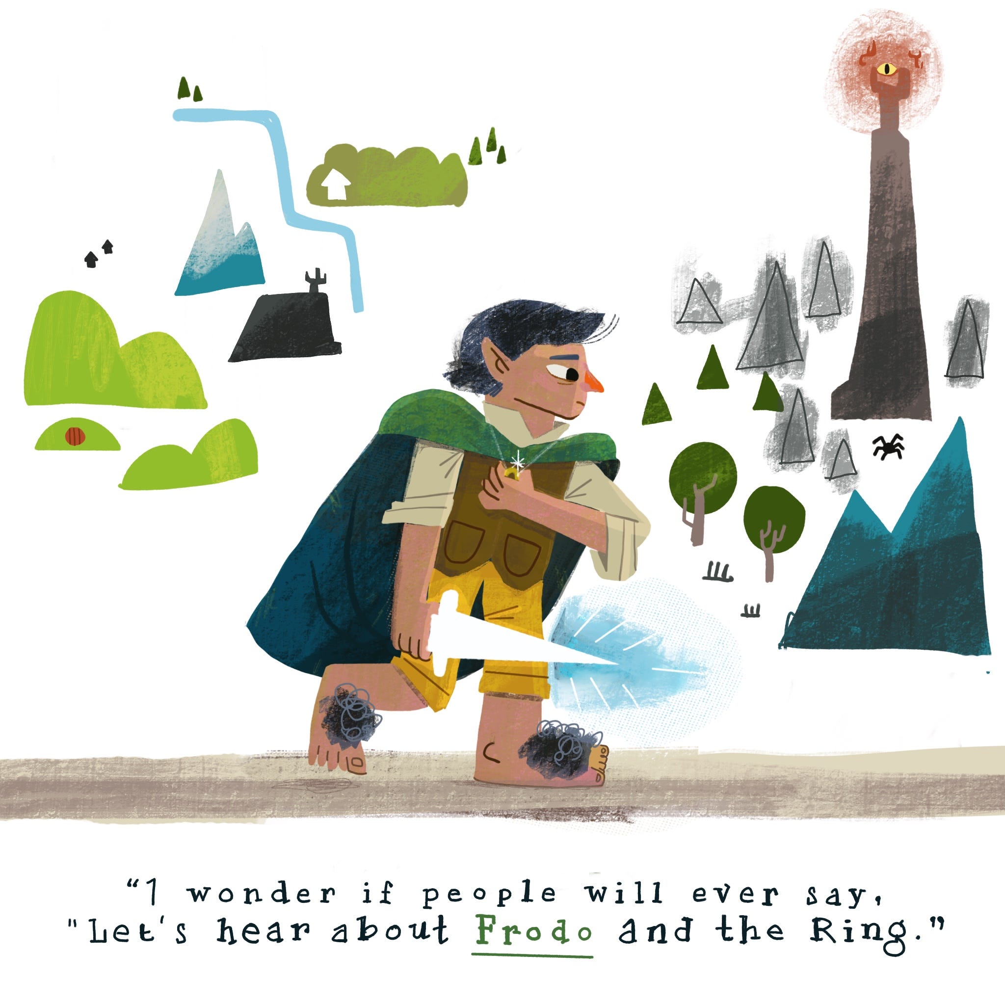
One of the primary ways I apply texture to my illustration. Is what I’ll call ‘Screen tone’ style.

In manga, shading traditionally is added by using screens of halftones onto the page and removing the parts of the screen that are not needed.

I use this same mental model when applying texture to my illustrations. Except instead of using a ‘screen tone’ sheet, I use a texture brush. But the idea is the same. Lay down the texture and cut out the parts that are not needed.

I use this texture layer to describe both the shading of a piece, but also the tactile quality.

Here’s a trick if you want something to look coarse, use more tonal contrast between the base colour and the texture. (Like the floor) . If you want something to look smooth use less tonal contrast. (Like the cape)

I hope this gives you some ideas about how you can use texture in your own illustrations.

Ps: I love coffee.

Share this post

Texture in illustration

adamming.substack.com
Previous
Next
Comments
TopNewCommunity

No posts

Ready for more?

© 2023 Adam Ming
Privacy ∙ Terms ∙ Collection notice
Start WritingGet the app
Substack is the home for great writing