


🍿 How to create a Color Palette
🍿 How to create a Color Palette
A guest post by Anny Chen

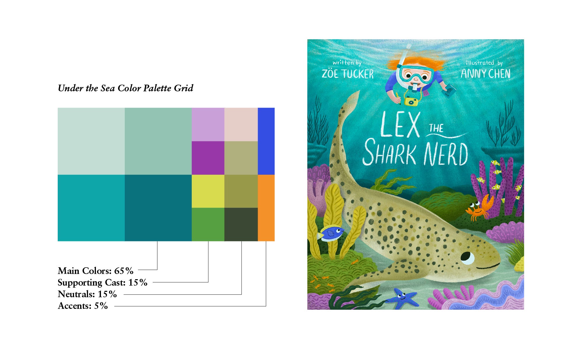
Inspired by Lilla Rogers’ fabulous Blobby Color Palette worksheet, I decided to create my own systematic way of making color palettes for illustrations. Coming from a graphic design background, I love grids. My simple color palette maker consists of a 14-block grid that is organized into four sections: four main colors, four supporting cast colors, four neutrals, and two accents. The size of each section is proportionate to its percentage of color in the illustration. Below is an example of my color grid next to the final art:
Once I have my basic color grid down, I’ll import the palette into Procreate and startblocking out where the colors go in my composition. The rest of the process is muchmore intuitive. As I start drawing, I’ll adjust the values to add more tints and shadesas needed to flesh out the final image. The color grid is a great jumping-off point thatgives me the limits I need to then play and experiment directly on the page.
How do I initially pick the colors for my color grid? Reference Imagery! Before the start of any illustration, I collect tons of reference images based off of the theme and subject. Pinterest is my favorite platform to use, where I have a library of over 1,600 pins categorized by subjects (anything from dogs to vintage candy shop storefronts). The images will often inspire an overall mood that dictates the main color palette.
When illustrating for a picture book, I will also make sure to circle any visual details in the text relating to color (e.g. a red backpack). Sometimes I’ll have a strong vision for a character based off of the environment that they’ll be placed in. For example, with Lex the Shark Nerd, I knew I wanted Lex to have orange hair, because he was going to be in a predominantly blue scene. Since orange and blue are complementary colors (they sit on opposite ends of the color wheel), I knew that Lex’s orange hair would make him pop out in the scene and immediately grab the reader’s eye.
Below is another example of my color grid next to the final art. I hope this post will inspire a new approach to thinking about color in illustration, and help you create your own fun and unique palettes!
This post is Guest Authored by Anny Chen
Anny Chen is a designer illustrator living in Paris, France with her husband and three-year-old son. She makes warm and playful illustrations that express a range of human emotions in colorful, richly-detailed environments. She is currently seeking representation for illustration work in children’s picture books. You can follow herprocess on instagram or check out her portfolio on www.annychen.art.
Adams Notes:
📝 Thank you Anny for this great post and demystifying palette building and giving us the steps to get started making our own color palettes for illustrations.
If you have any questions about this post please leave them in the comments and I’ll try to get an answer from the author.
And if you have an idea for a guest post around the topic of making picture-books hit reply and tell me about it!
Adam Ming
This is a really interesting method, and it clearly works really well for you.
I do a similar thing, but more blobby and with lines scribbled through to see how they stand out against each other. Usually based on my large go-to palette, but lately I have been mixing it up with trend-focused palettes or brand palettes, and am pleasantly surprised that I can usually make them work, too.
I used to really hate colour choices and was hideously awful at it, looking back, but it's one of my favourite things to do now.
Love this very structured and no-nonsense approach to colour palette and ratios!